Having looked at thousands of CVs over my lifetime, and still looking at hundreds each week I am still surprised that more time is not put into the presentation, content, grammer, and believe it or not spell checks. A candidate’s CV is, in many cases, the very first impression a perspective employer will have of them and I would expect that anyone serious abut finding work would want to make as strong an impression as possible.
This week I thought I would highlight some CVs I have come across online who’s author’s clearly wanted to make a strong, if slightly unconventional, impression.
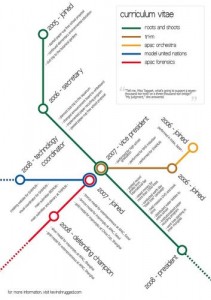
Here (above) Kevin Wang uses a tube style map. I know these may not suit everyone, but for me they are a refreshing glimpse of how CV’s could evolve.
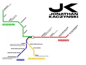
Here Jonathan Kaczynski uses a tube map style. Maybe such a graphical representation of your career/ experience could or should be a introduction page of a 2-3 page CV as an attention grabber. On the other hand as a busy recruiter can you afford to spend the time to try and decipher these elaborate presentations when you may have dozens or even hundreds of CVs still to review. What do you think?


Graphical CV’s|
What an amazing idea for a CV…. So many people think that you can only submit a graphical CV if your applying for a strictly arty job but i disagree? No ones saying you’ve got to go mental and do anything outlandish but why are people so squeemish about diverting from the standard CV layout. When your sifting through thousands of CV’s the ones which stand out, hold your attention, and have been constructed for easy/fast/entertaining reading are the ones which most impress… Up with the graphical CV!
I realise this is an old post but I thought I should comment!
I came here as I am designing a graphical CV myself, although the main challenge is as highlighted above – getting a balance between information and aesthetics, the Kevin Wang CV looks beautiful, although I find it a little confusing, and yes, you want impact but not at the cost of ease of understanding! They say a picture says one thousand words, you really want to take advantage of that!
I’m currently designing a graphical CV as I work as a trainer, and being able to convey relatively complex information in a conceptual graphic is an important skill, but a skill that is often overlooked, so am designing something to evidence that skill, and (hopefully!) get my CV to the top of the pile as it were!